
I understand that I am quite possibly alone in this.
If not alone, then a safer bet is in a low population minority looked on with confusion by the majority.
But I'm just not a fan of massive amount of detail.
I prefer the elegance of simplicity over the burden of Baroque.
Games Workshop: please halt the mechanized decapitator of your skull-making factory.
Privateer Press: not every mini must compete in spikiness against the Shrike.
Mini Manufacturers everywhere: It is ok for a mini not to carry the contents of their household in bags & packs.
Not all of course..many fall right where I like it best: Copplestone, Zombiesmith, World of Twilight
I suspect the trend in details started as the cost of metal went up and the relative cost of having sculptors outdo one another to add more detail was insignificant in cost in the overall process, and companies were eager to show off the finer detail of the ever increasing quality of casting techniques.
But just because the technology can do it, doesn't mean it is always an improvement.
Just because it now must cost me twice what a miniature once cost doesn't mean I'll feel I 'get my money's worth' if the mini has 35 skulls & tiddlybobs all over him.
If a pizza is going to cost twice what it used to because the cost of running the oven is twice what it used to be, don't throw walnut shells and candy corn on it thinking I'll be happier about it.
So I've been noticing a tendency for miniatures to be too detailed lately.
Just laden down with a Liberace-level of visual confetti.
Someone thought Versailles furniture was a good idea, so I imagine someone- manyones- probably love all the gory and gaudy detail but I think it's often overmuch.
So I've noticed I have been converting to remove detail rather than add it.
One of the most afflicted are banners.
How often is a mini forced to hold up a banner half the size of a tallship's mainsail, adorned with an anvil, half dozen corpses, minotaur skulls, or made of solid brass?
So here are some Skorne conversions. I love the idea of Skorne, who make me think of VSF Martians in a lot of ways, and their beasts are great. But I find I remove all the back banners, clip off the multi-back spikes, shave the horns off shoulder pads, and more.
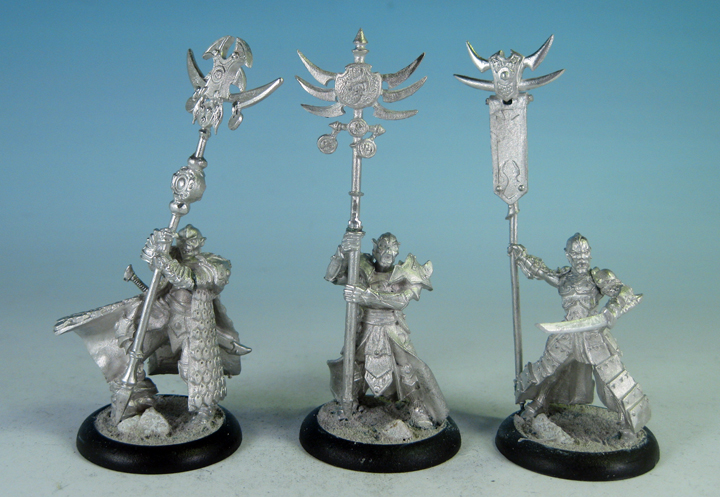
Their banners are especially burdensome. Here are three after converting:
 These have plenty of detail. Almost too much even after converting, to my eye. Plenty of spiky parts and charms, showing an ornamental culture. For two of these I've used back banners removed from characters to be the standard, and the third I cut away a lot of the extra bits that to my mind looked like someone had designed it in absent minded doodling while bored in class.
The originals:

Maybe nothing wrong with them, just not a style I appreciate: it's just too much.
A: Army standard: This might look cool mounted on a wall, but that solid metal gong icon must be impossible to hold up! Completely awkward even if it is painted wood.
B: Just a flag, but a big one! But this is just a unit's banner, should it be bigger than the army standard? and notice the side metal on the right edge, much like the one C has on the left side? that'd be a lot of extra weight for this poor fellow to hold!
C: That side metal jutting out, up and back to hold a flag that a simple pole up would hold seems silly, plus it detracts from the banner it is holding.
So I replaced the two massive items and cut away the pointless metal pole detour on the third, opting for simpler icons.
Sometimes less is more. Or I think so at any rate.
Oh, and get off my lawn.
;)
If not alone, then a safer bet is in a low population minority looked on with confusion by the majority.
But I'm just not a fan of massive amount of detail.
I prefer the elegance of simplicity over the burden of Baroque.
Games Workshop: please halt the mechanized decapitator of your skull-making factory.
Privateer Press: not every mini must compete in spikiness against the Shrike.
Mini Manufacturers everywhere: It is ok for a mini not to carry the contents of their household in bags & packs.
Not all of course..many fall right where I like it best: Copplestone, Zombiesmith, World of Twilight
I suspect the trend in details started as the cost of metal went up and the relative cost of having sculptors outdo one another to add more detail was insignificant in cost in the overall process, and companies were eager to show off the finer detail of the ever increasing quality of casting techniques.
But just because the technology can do it, doesn't mean it is always an improvement.
Just because it now must cost me twice what a miniature once cost doesn't mean I'll feel I 'get my money's worth' if the mini has 35 skulls & tiddlybobs all over him.
If a pizza is going to cost twice what it used to because the cost of running the oven is twice what it used to be, don't throw walnut shells and candy corn on it thinking I'll be happier about it.
So I've been noticing a tendency for miniatures to be too detailed lately.
Just laden down with a Liberace-level of visual confetti.
Someone thought Versailles furniture was a good idea, so I imagine someone- manyones- probably love all the gory and gaudy detail but I think it's often overmuch.
So I've noticed I have been converting to remove detail rather than add it.
One of the most afflicted are banners.
How often is a mini forced to hold up a banner half the size of a tallship's mainsail, adorned with an anvil, half dozen corpses, minotaur skulls, or made of solid brass?
So here are some Skorne conversions. I love the idea of Skorne, who make me think of VSF Martians in a lot of ways, and their beasts are great. But I find I remove all the back banners, clip off the multi-back spikes, shave the horns off shoulder pads, and more.
Their banners are especially burdensome. Here are three after converting:
The originals:

Maybe nothing wrong with them, just not a style I appreciate: it's just too much.
A: Army standard: This might look cool mounted on a wall, but that solid metal gong icon must be impossible to hold up! Completely awkward even if it is painted wood.
B: Just a flag, but a big one! But this is just a unit's banner, should it be bigger than the army standard? and notice the side metal on the right edge, much like the one C has on the left side? that'd be a lot of extra weight for this poor fellow to hold!
C: That side metal jutting out, up and back to hold a flag that a simple pole up would hold seems silly, plus it detracts from the banner it is holding.
So I replaced the two massive items and cut away the pointless metal pole detour on the third, opting for simpler icons.
Sometimes less is more. Or I think so at any rate.
Oh, and get off my lawn.
;)
8 comments:
You sound like me now Ferret. "Damn kids and theIR music. Doesn't make any sense. Why, when I was a kid, we didn't play electronic drums...."
But you are right of course, especially about GW. What they think makes an elf, makes me cry.
I've felt the same for a while.
To me all the detail obfuscates the real sculpting... maybe that's the point. It's hard to make out bad proportions and silly poses when the figure looks like it fell in the king's tackle box.
Nice conversions.. and a nice "little" rant.. I miss these :) Waiting for the paint now ;)
I can understand that and trying to paint lots of fiddly bits is dead annoying as well.
Perfectly reasonable rant, although there will always be a demand for boutique style miniatures. For me, I would hate to have spent all that time painting up a vastly complicated banner to see it bent as the miniature topples over; there is just little for the individual to personalise so less can most certainly equals more.
I am not a fan of 'busy' miniatures either. Painting some historicals (ECW) recently brought home once again that sometime less really is more.
well nice to see i'm not as alone as I'd have thought. Maybe there is more of a market for simpler, less busy miniatures than a lot of the manufacturers might be assuming.
Knob: "king's tackle box" I love it.
Gareth: I have been tempted so many times to get into ECW, love the look of the period.
Anne: "back in my day... I had an onion on my belt, which was the fashion at the time. A nickle had a bumblebee on it: '5 bees for a quarter' you'd say." :)
Really warriors would shed that excess .. weapon blow catching... junk.
Post a Comment